A system born from the logo

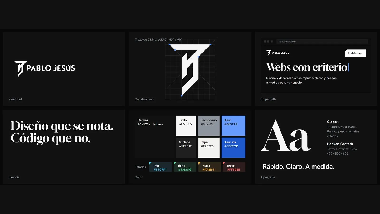
Before I had a design system, I wrote code and built components as I went, trying to make them fit. Every new piece was an isolated decision. Today, whenever I want to add something to the site, I have a clear direction.
A map before building
To me, a design system is a map: a source of truth I go back to every time I have to decide. It is not a collection of nice buttons, it is a set of criteria. If a new piece does not fit the system, the problem is usually the piece.
The cut came from the logo
My logo is a monogram of my initials, PJGR, joined by a straight, firm line that shows the character I have today. Its strokes only use 0°, 45° and 90° angles, and the top bar ends in a diagonal cut.
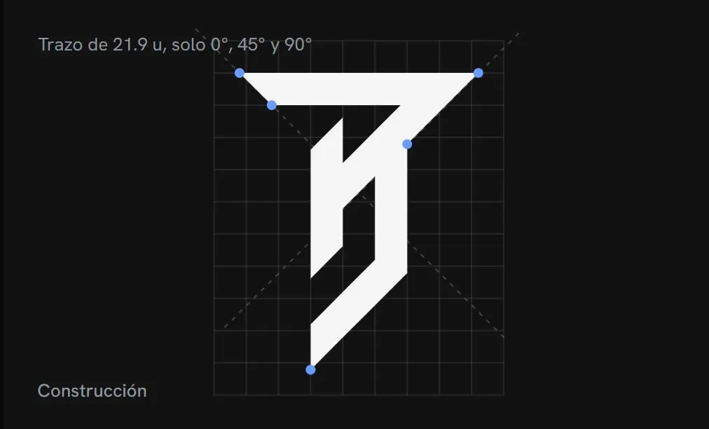
The idea of carrying that cut across the whole site was not there at the start. It came up along the way, while using the logo and the brand to shape the design. Today the cut is in the buttons, in the corners of the images, at the entrance of some sections and in a triangle of colour that appears once per page. It is the part of the system I defend most: it gives the site its identity even when the logo is out of sight.
The hardest part: the colour
The hardest decision was the accent. I wanted a colour of my own, not the generic blue of the industry, but one that felt like me, and I identify with black and blue. That is how Azur was born: a bright blue on a base of blacks and greys.
The colour came with a rule that forces me to choose: Azur appears only once per screen, almost always inside the cut. If everything is lit up, nothing stands out.
A single source of truth
Every value in the system, colours, type sizes, spacing and motion, lives in one file. From there it generates the CSS variables, the Tailwind theme and a format that can be imported into Figma. If I change a value, it changes everywhere.
I tested it this week: I changed the headline typeface from Fraunces to Gloock. Gloock is more me, it suits my personality and it sits in harmony with the logo. The change took a few lines in that file and the whole site updated, with the type scale adjusted to the new letterforms.
I set the criteria, AI makes it concrete
I built the system working with artificial intelligence tools. The split is clear: I bring the criteria, the creativity, the decisions and the direction. AI takes my ideas, organises them and turns the design I have in my head into something concrete, in far less time.
From my site to Drakkar and my clients
I am already using this approach at Drakkar, the agency I run, which is usually my lab. The plan is to bring the same process to my clients’ projects: start from their brand, draw a few rules from it and build with that map, to deliver better products in less time.