The details that stayed


A static website, however original its design, is like a printed magazine: just one more. Details give a project personality, soul and life. But not just any detail.
The cursor that writes with me
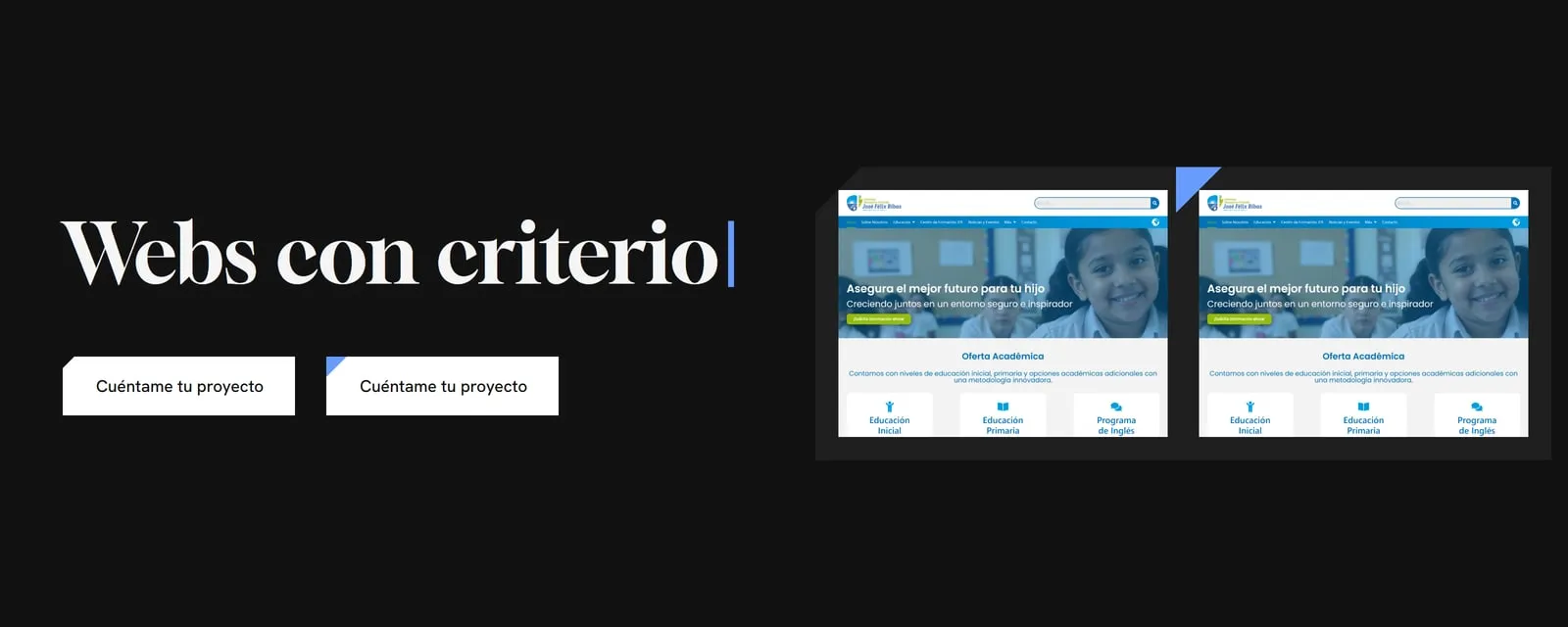
Every page on this site opens with a headline that does not end in a full stop but in a blue cursor, which appears once the headline has finished rising. It is a kind of easter egg: a reminder that I am a web developer. That cursor is my everyday environment, the one that builds the craft of code alongside me.
The cut that lights up
Buttons and project images carry the same 45° cut corner as the logo. On hover, a button’s cut opens wider and lights up in Azur, and an image’s corner fills with the same colour. That is all: no jumping buttons, no floating cards.
What I left out
I ruled out excessive hover movement on buttons: it was more of what you see on every other site. There are no cards that lift as if they were floating either. I think we are saturated with cards and their time has passed. They may come back, because trends tend to return.
My rule: a detail has to lead somewhere
A detail adds something when it prompts an action or draws the visitor’s attention to a point of interest. Animating for the sake of it only distracts. That is why Azur lights up where there is something to do: a button, a link, a project to open.
And there are two limits I do not negotiate. Content never waits for an animation: the headline can be read from the first moment. And anyone who has reduced motion turned on in their device sees the site still, with everything in place.
My favourite: the sweep between pages
When you move from one page to another, the new one sweeps in while the previous one steps aside. It gives the visitor the feeling of a smooth visit, with no abrupt cuts when the page changes.
On my clients’ sites
Details also go into my clients’ projects. There I try to infuse each client’s personality: they are like the accessories of a good outfit.
Another detail on this site, the line that says how long the page took to appear, has an article of its own: The site that times itself.